How do the buttons work?
One way to increase the click rate on your websites, such as your newsletters, is with a call to action button or CTA. Call to action buttons, are some of the most important elements in designing a newsletter, as they make it easier for subscribers to perform the conversion action you hold as the primary goal of the newsletter.
You can include a CTA button to perform actions such as downloading documents, being redirected to a website, or any other type of action that you seek as a conversion objective. The most important thing is that they capture the attention of the reader and lead them to generate the intended action.
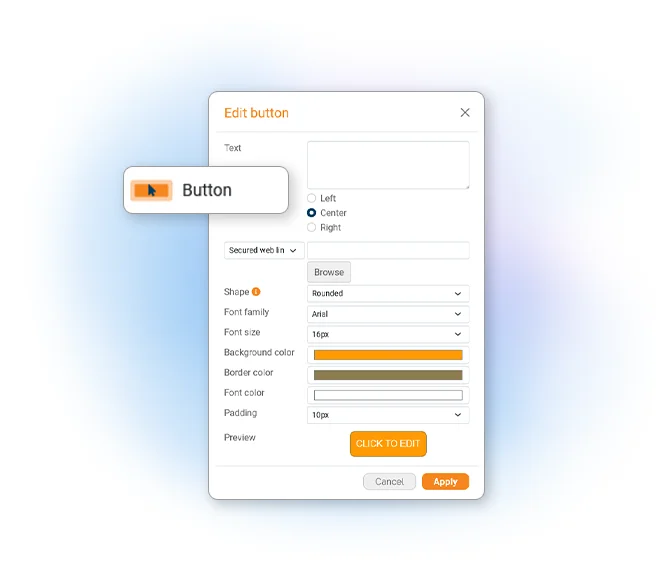
To do this, you can find a function that will allow you to create different types of buttons in the newsletter editor:
- The classic link (http)
- The secure link (https)
- The "call me" link (phone)
- The message link for Skype (chat)
- The call link for Skype
- The SIP link
- The FTP link

The call to action buttons in the email marketing campaign must be attractive and be consistent with the brand identity of your client, services or company. You can define the size, shape, font size, alignment, background color and border. These buttons are created in HTML, since images are pretty heavy and are displayed even if the e-mail program can’t display the images.
Integrate call-to-action buttons in your email marketing campaigns and increase the click-through rate of your sending. Here are some great CTA Examples:
Email Marketing Software
& Email Automation
This site uses Cookies, by continuing your navigation, you accept the deposit of third-party cookies intended to offer you videos,
sharing buttons, but also understand and save your preferences. Understand how we use cookies and why: More information
